Color disputes often begin with two reasonable but different questions: “Does this file contain the right brand color?” and “Does this finished box look like what we approved?” Two packaging color-difference discussions on Reddit show the buyer confusion, but they are question signals rather than evidence for a production standard. A useful purchase specification connects the artwork target to a physical approval chain.
Buyer Answer: Treat RGB or HEX as screen references, not physical acceptance criteria. Choose a CMYK process or named spot-color route, then proof on the exact paper, board or wrap with the intended laminate, varnish and texture. Approve against a signed physical production reference, using the viewing light and measurement method agreed by buyer and supplier.
What a color reference can—and cannot—approve
A screen emits RGB light; printed packaging reflects ambient light through ink, substrate and surface treatment. That is why a HEX value can identify a design intention without predicting the finished object. Even the same ink can appear cooler, warmer, duller or darker when paper white point, absorbency, texture, opaque white, laminate or varnish changes.
Separate two approvals. A digital layout approval freezes copy, dimensions, image placement, separations and version control. Physical color approval establishes the target appearance on named materials. For process artwork, define the CMYK profile and output conditions with the prepress provider. For a brand-critical solid, a named spot color can create a clearer ink target, but it does not cancel the material and finishing variables. The print-ready artwork and dieline guide covers file construction; the finishes guide helps freeze the surface stack.
A nine-gate color approval workflow
- Receive the brand reference. Record whether it is RGB, HEX, CMYK, a named Pantone reference, a printed brand standard or an approved existing pack. Photographing a reference does not convert it into a measurement standard.
- Choose the print route. Define CMYK process for imagery and builds, a named spot-color route for a critical solid, or an intentional combination. Do not let an unnamed “burgundy” substitute for a controlled target.
- Freeze the substrate. Name the paper, board or wrap grade, supplier code, shade or white point, and any opaque underprint. A white coated sheet and a warm uncoated sheet are different color systems.
- Freeze the finish stack. State gloss or matte lamination, varnish, coating and texture. If embossing changes how light falls across the area, include it in the sample review. Revisit finish choices with the packaging finishes guide when needed.
- Approve layout separately. Use the screen PDF or digital proof to approve content, trapping intent, dieline position and separations. Mark it “layout approved” rather than treating it as final physical color acceptance.
- Compare a physical color proof. Review an ink drawdown on the actual stock or an appropriately specified contract proof. Document what the proof simulates and what remains press-dependent.
- Approve the converted sample. Inspect a printed, laminated or varnished, folded sample so color is judged with real construction, grain, seams and adjacent materials. Use the pre-production sample checklist to record the wider sample decision.
- Sign and retain the production reference. Buyer and supplier identify the approved piece, version, date, substrate, finish and authorized approver. Store it protected from light, moisture and contamination.
- Define reapproval triggers. Require a new decision when ink system, press route, substrate lot or grade, paper white point, laminate, varnish, artwork build or approved reference changes. Purchase documents should say who can waive or require reapproval.
Which proof answers which question?
| Approval item | What it proves | What it does not prove |
|---|---|---|
| Screen PDF | Content, layout, version and stated color definitions. | Printed appearance, substrate influence or finish shift. |
| Digital proof | Layout and an approximate calibrated preview under its stated simulation. | Exact ink interaction with the chosen wrap, coating or press. |
| Ink drawdown/contract proof | A physical color comparison under defined proof conditions. | Every folding, laminating, varnishing or production-press variable. |
| Printed folded sample | Appearance after actual substrate, print, finish and conversion are combined. | That future material or process changes will remain equivalent. |
| Signed production reference | The physical benchmark and approval authority for the agreed job. | A permanent universal color independent of storage, light and materials. |
Worked example: one muted burgundy, three material outcomes
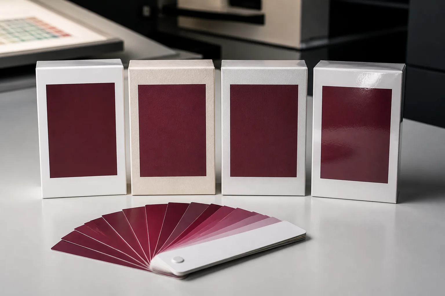
Imagine a buyer supplies a muted burgundy brand reference. On white coated paper, the printer can establish the selected CMYK or named spot route against a bright, smoother base. Move that same target to warm uncoated paper and the substrate contributes warmth while absorbency may reduce saturation. Add a matte laminate over the white coated version and reflected glare falls, but the perceived depth and contrast can also change.
The correct decision is not to declare one formula universally accurate. Build and label separate physical samples for the combinations being purchased, compare them under the agreed viewing condition, and decide whether the brand goal is “same ink recipe” or “closest approved visual family across materials.” This guide intentionally declines to invent a universal Delta E tolerance. If instrument readings will be used, buyer, printer and converter should agree the device, geometry, illuminant, backing, sample location, calculation method and acceptance rule for this job before production.
Color information to include in the RFQ
- Artwork files with color mode, profiles, separations and named spot references clearly identified.
- A physical brand standard when available, plus who owns and signs the approval decision.
- Exact paper, board or wrap code; white point or shade expectation; laminate, varnish, coating and texture.
- Required proof stages, viewing or measurement method, reapproval triggers and reference-retention plan.
- Box structure, quantity and destination so the supplier can quote the same scope rather than an assumed one.
Send those inputs through the custom packaging quote form and ask the supplier to return the proposed proof sequence in writing before artwork release.
Request a color-controlled quoteHow long does a color-matched sample take?
For a LuxoPack project, a physical pre-production sample — printed on the real board, wrap and finish — takes 3–5 business days after the artwork and the physical color reference are confirmed. A screen or PDF proof cannot approve color; only that physical sample can.
If the first sample is off, each further round adds another sample cycle, which is why the color inputs above should be complete before artwork release. Once you sign the sample, bulk production takes 12–15 days and is matched to the signed sample, not to the screen file.
Sources, scope and evidence boundary
Graphic Packaging International’s official prepress specifications PDF is a primary example of a converter’s file, color and proofing requirements. It supports the need to define a prepress route; it does not prove that its settings, proof type or tolerance apply to every supplier, substrate or LuxoPack order. The two Reddit threads linked above identify real buyer questions about color difference and Delta E readings only. They are not technical authorities, measured case studies or proof of factory performance.